Client: Candy Claws
What we did: Brand Identity | Strategy | Packaging
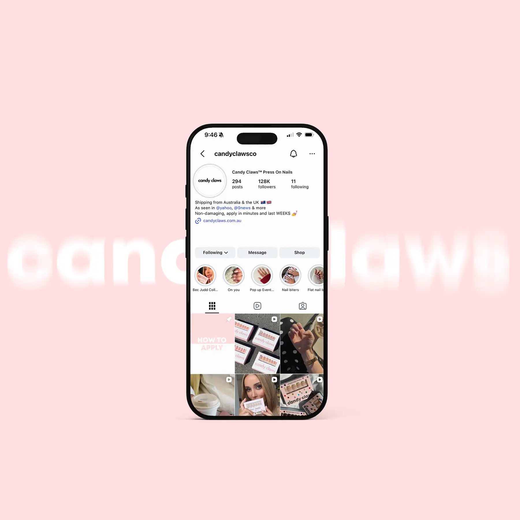
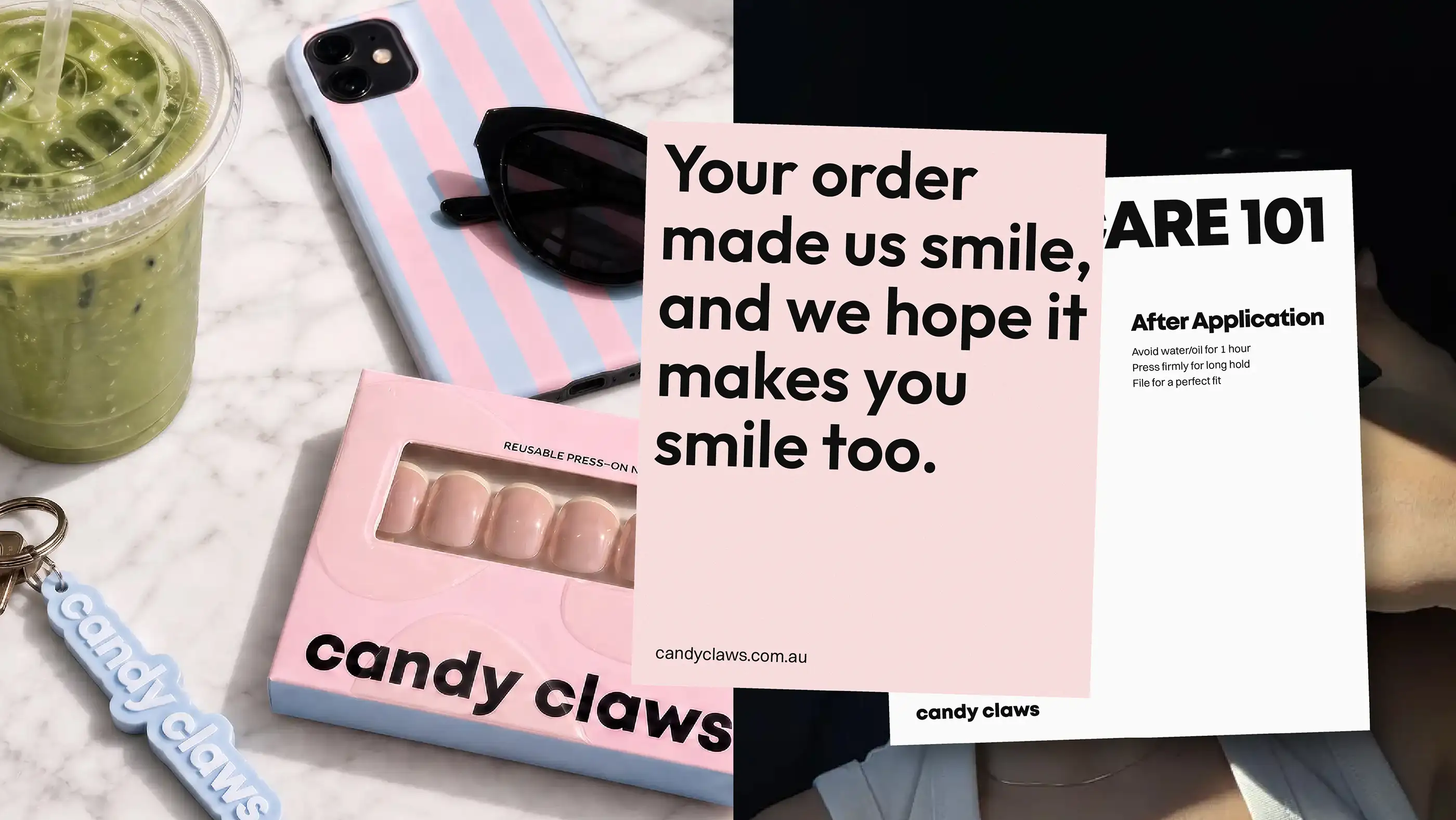
Candy Claws came to BOAST with something most brands are still chasing: momentum and a highly engaged online audience. Rather than reinventing the brand we decided to refine and strengthen what was already working commercially.
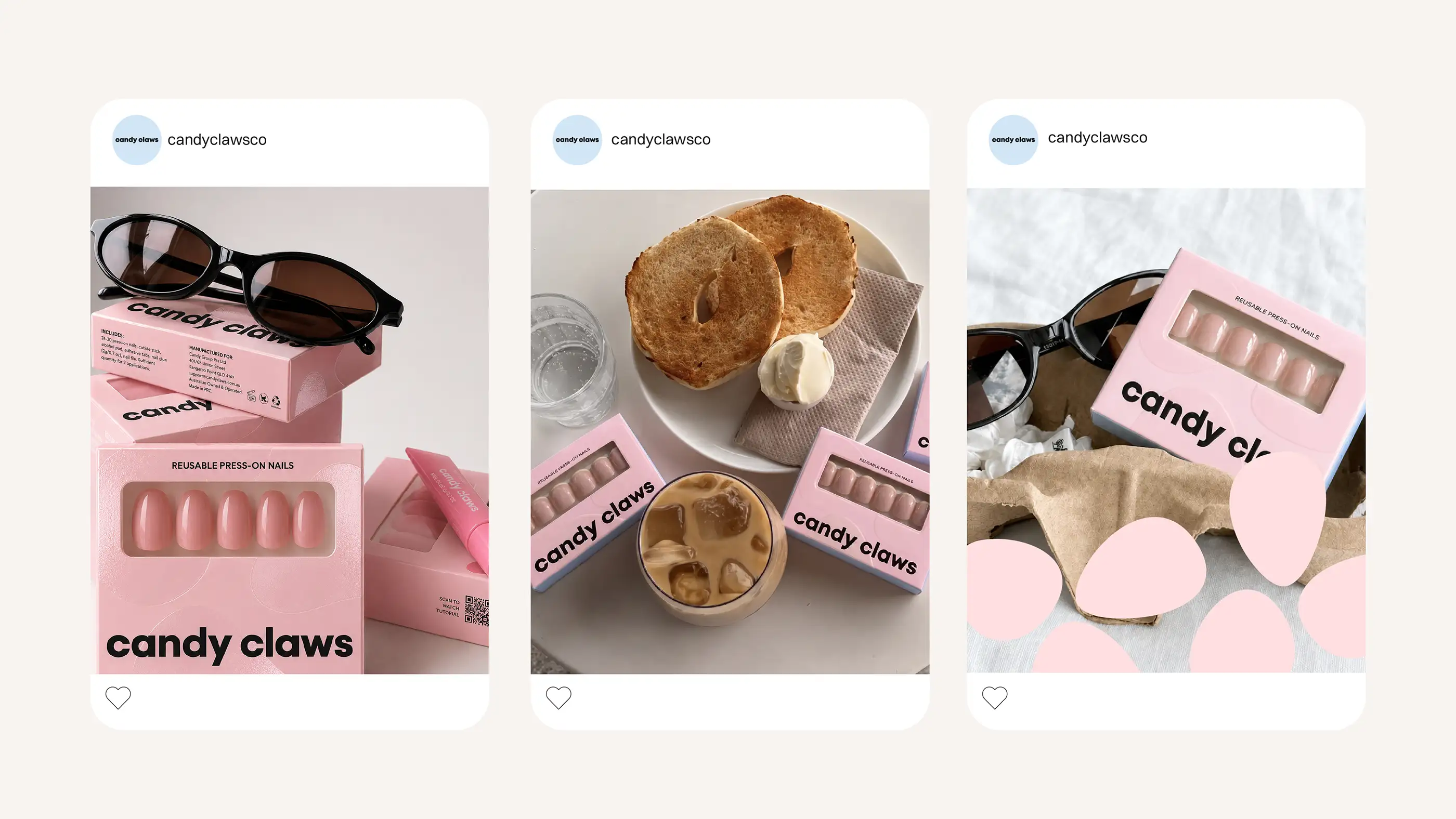
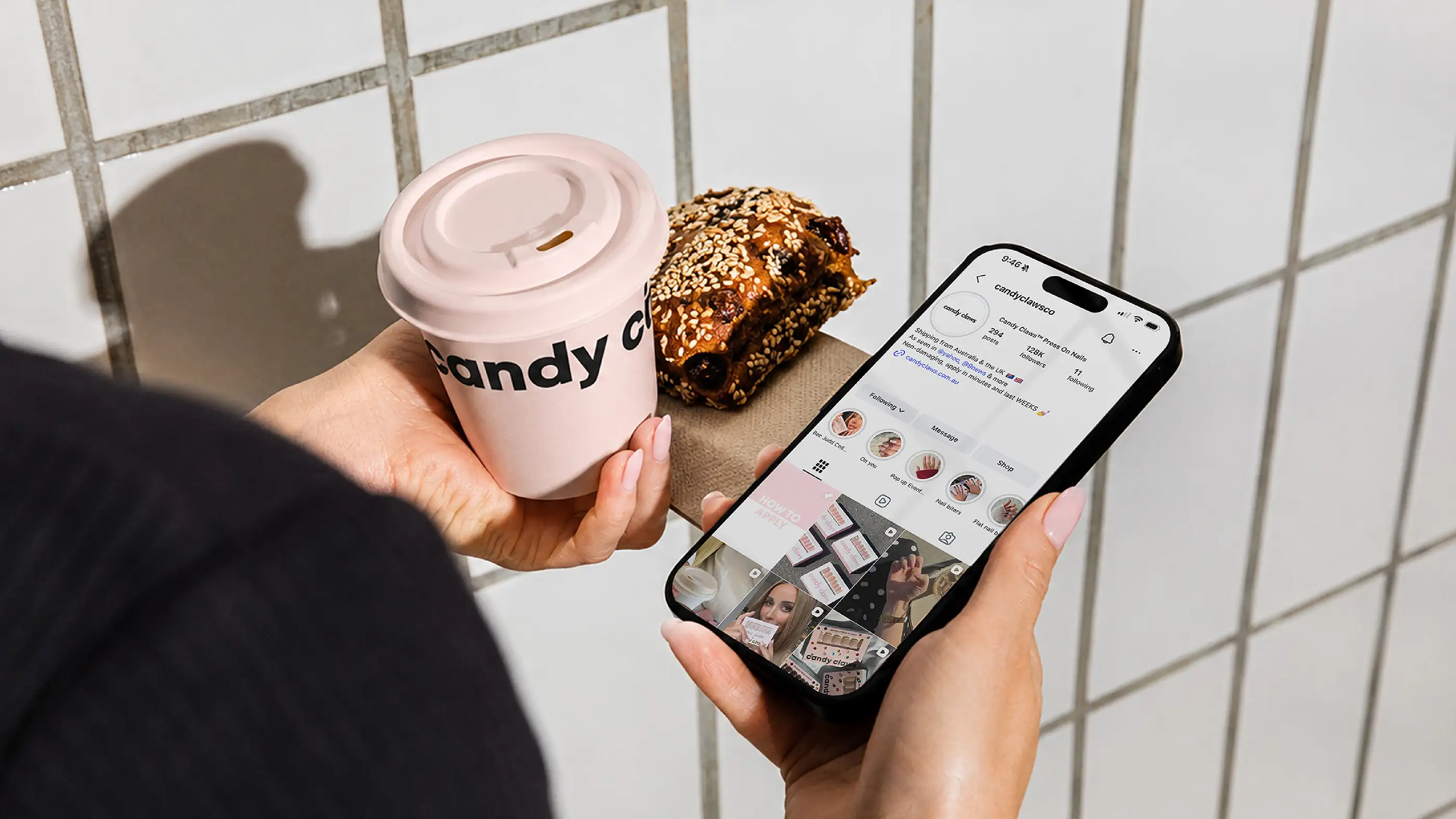
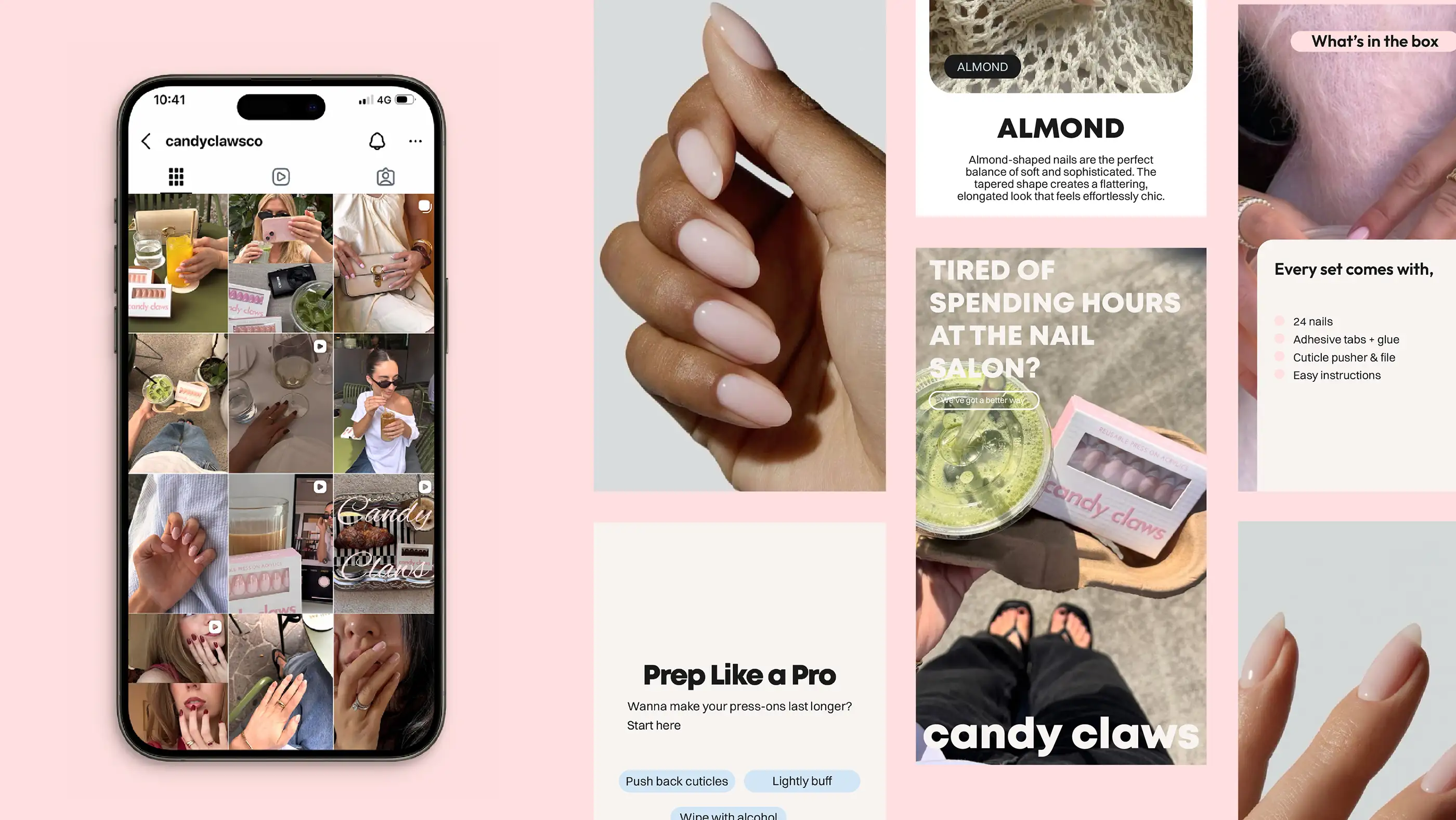
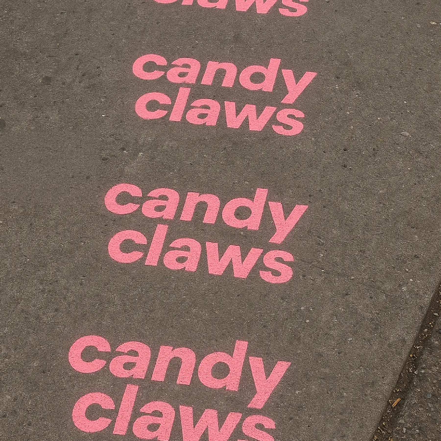
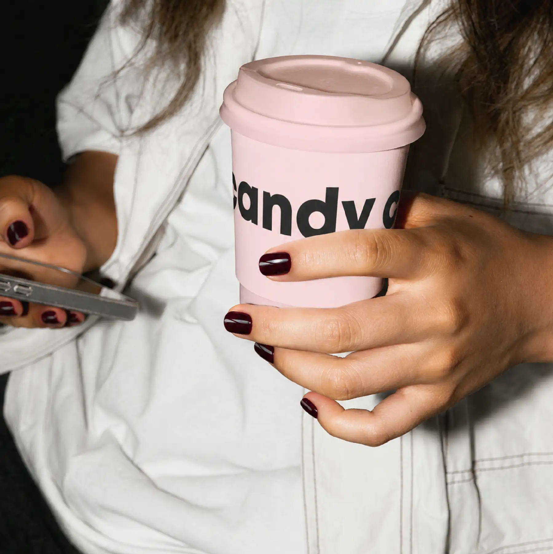
Working across creative direction, packaging refinement and content direction, we helped build a more cohesive and ownable visual world while protecting the social-first energy their audience already loved.
Introduction:
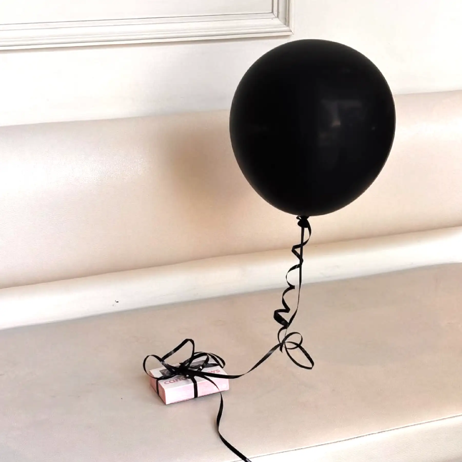
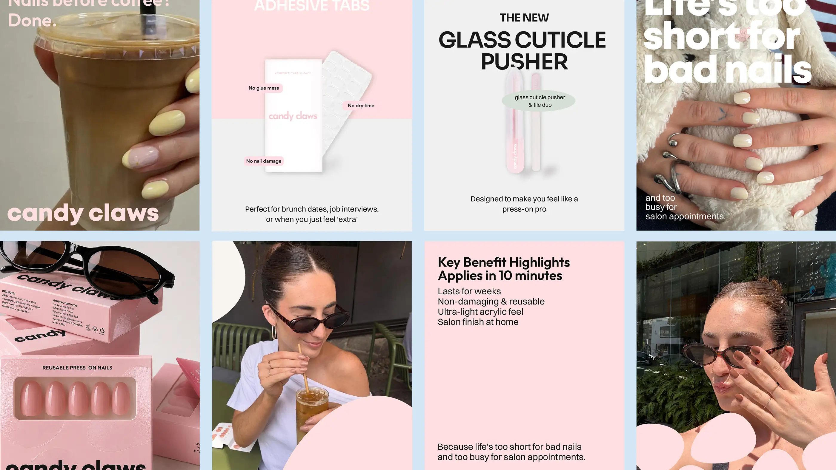
The strategy centred around leaning further into the lifestyle cues already performing strongly, and developing the “matcha runs, coffee dates, car selfies, getting ready” moments in order to create a visual identity that felt more cohesive, without losing the casual, viral-friendly feel that made it resonate in the first place.
The result is a brand that feels cleaner, stronger and far more intentional, while continuing to support the viral, community-driven growth the business is already known for.