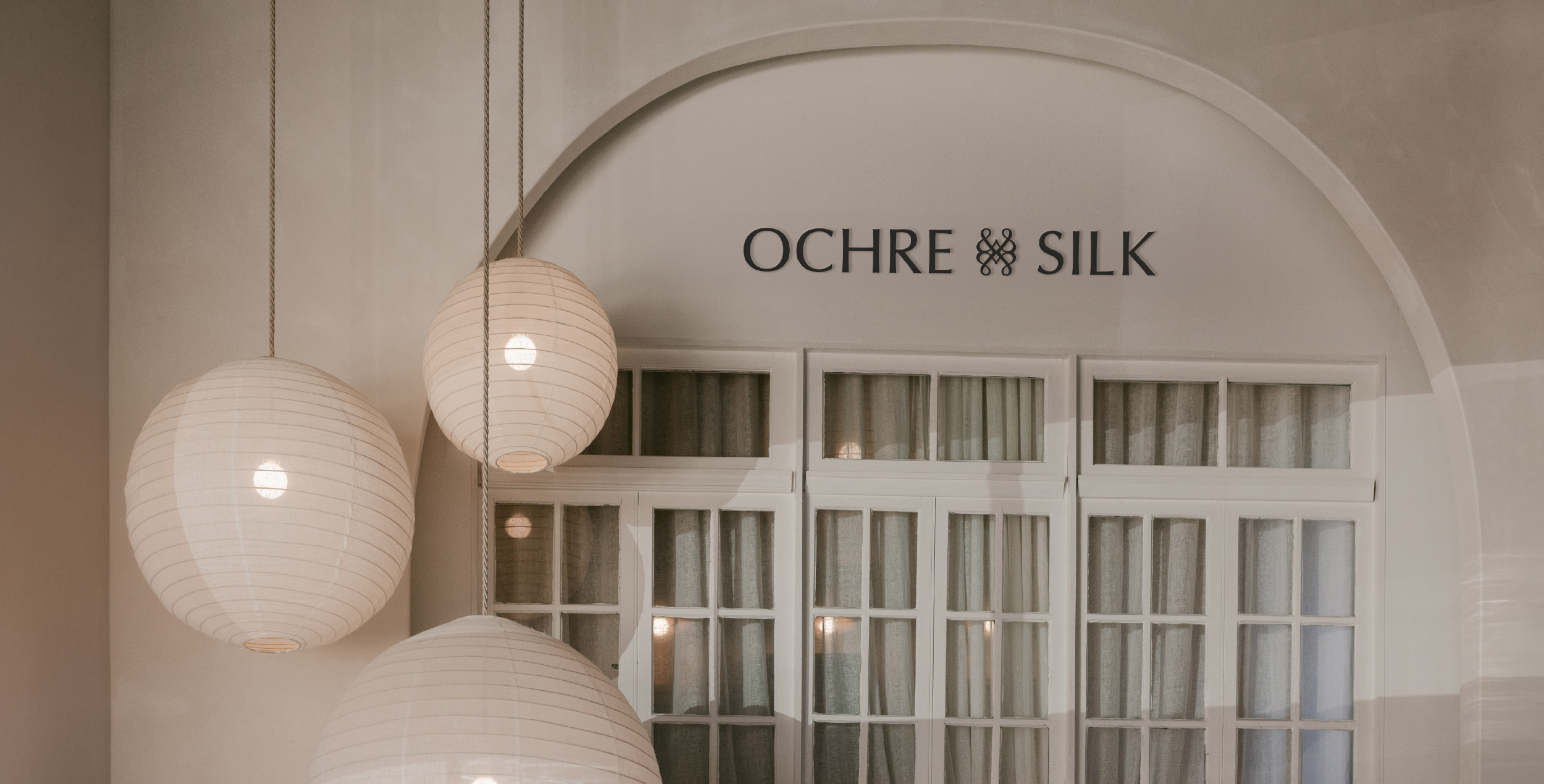
Client: Ochre & Silk – formerly Imprint House
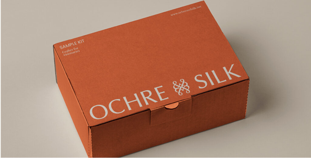
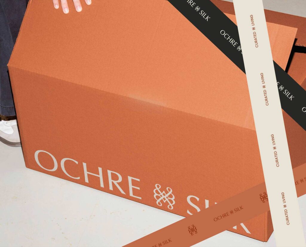
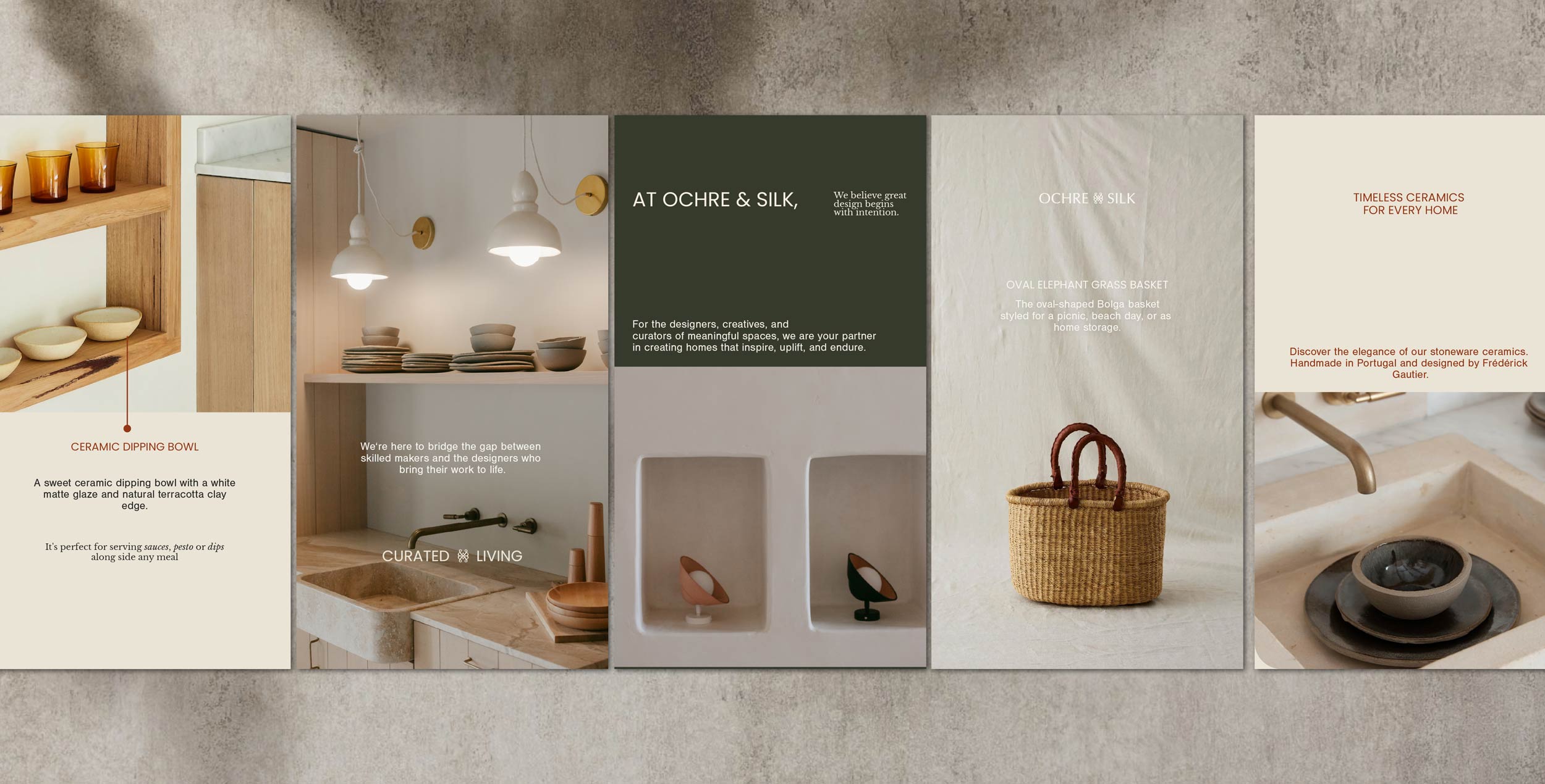
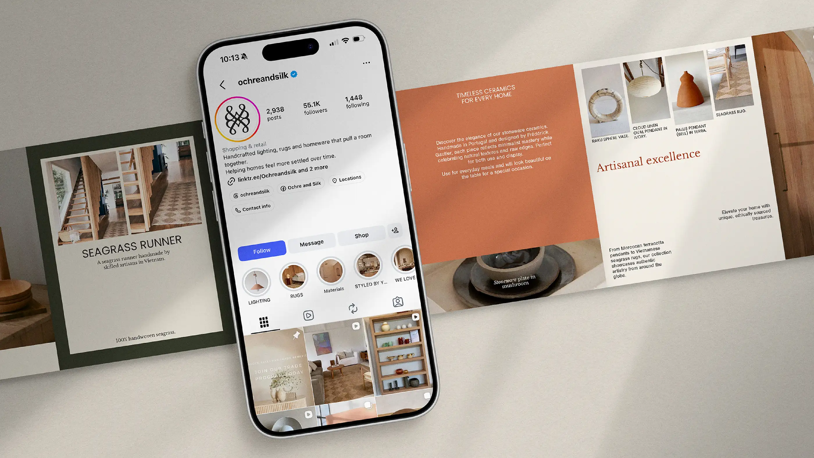
What we did: Brand Strategy | Rebrand | Packaging Design | Social Media
Commercial Outcomes: Successfully repositioned Imprint House under new ownership as Ochre & Silk | Retained brand equity while introducing a richer strategic direction | Established a differentiated position centred around globally sourced craftsmanship and storytelling | Built a scalable foundation for future product, content and community expansion | Created a stronger emotional connection between product, home and personal identity

The Challenge:
Most rebrands start with a dying brand.
This wasn’t one of them.
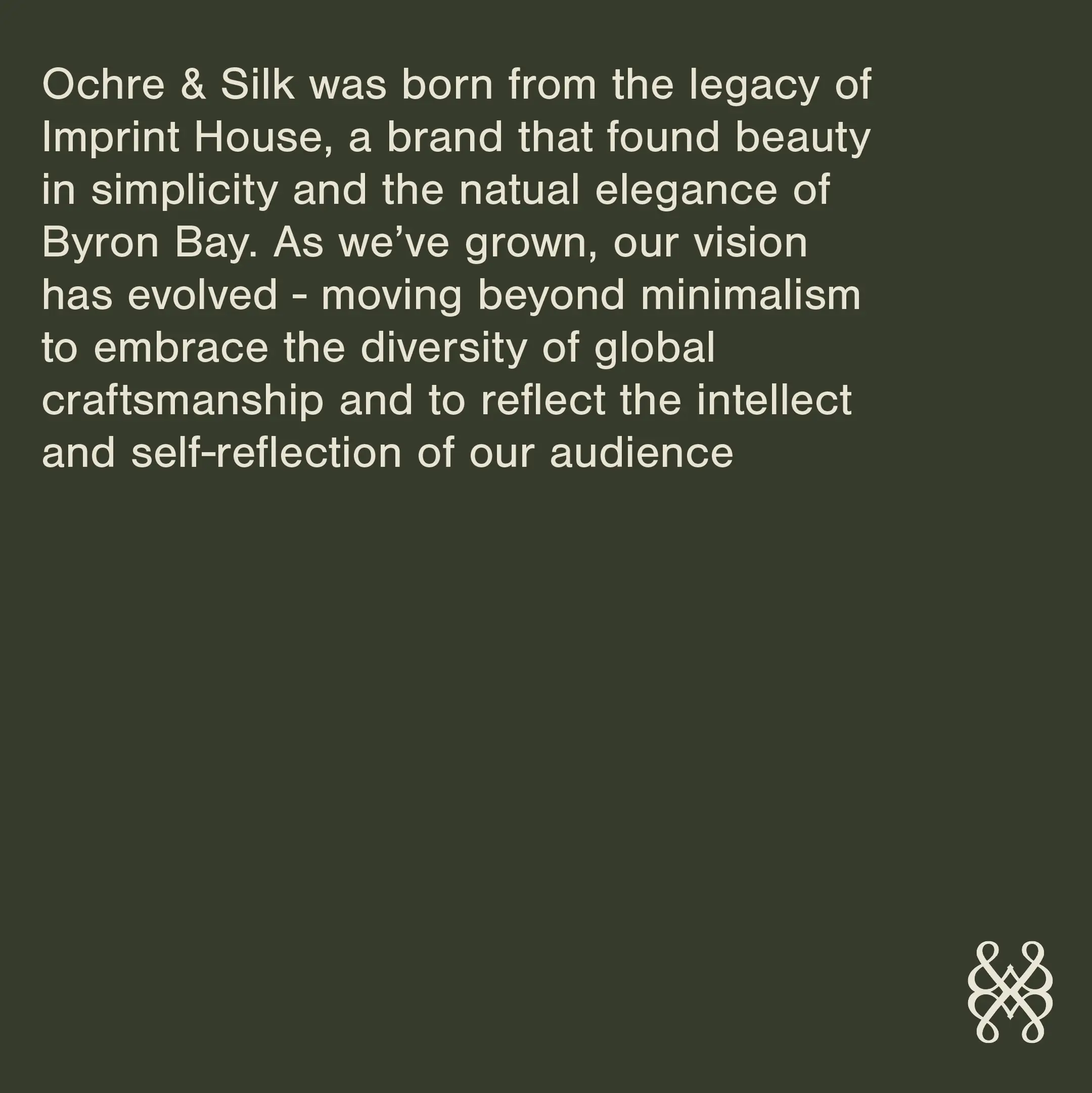
Imprint House had spent years building trust within the Australian interiors community. It was known for its curated aesthetic, considered products and loyal following. The challenge wasn’t creating something new for the sake of it. It was honouring everything people already loved while creating space for the brand to evolve under new ownership.
What stays? What changes? And how do you introduce a new vision without making it feel like the story has been interrupted?
The opportunity was never simply changing a name.
It was creating a brand capable of carrying a much bigger narrative. One that extended beyond products and into craftsmanship, culture, travel, storytelling and the emotional role our homes play in our lives.
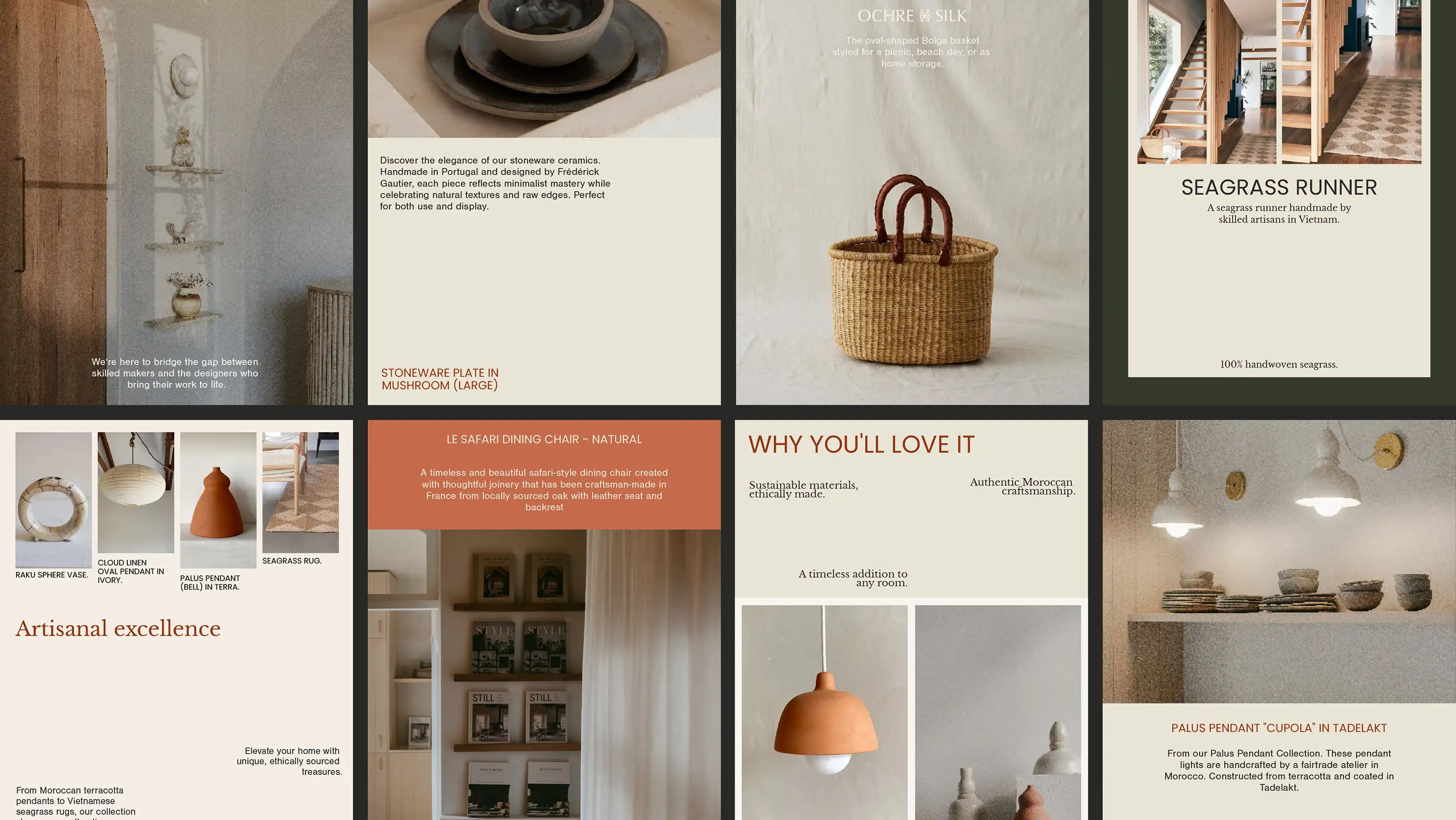

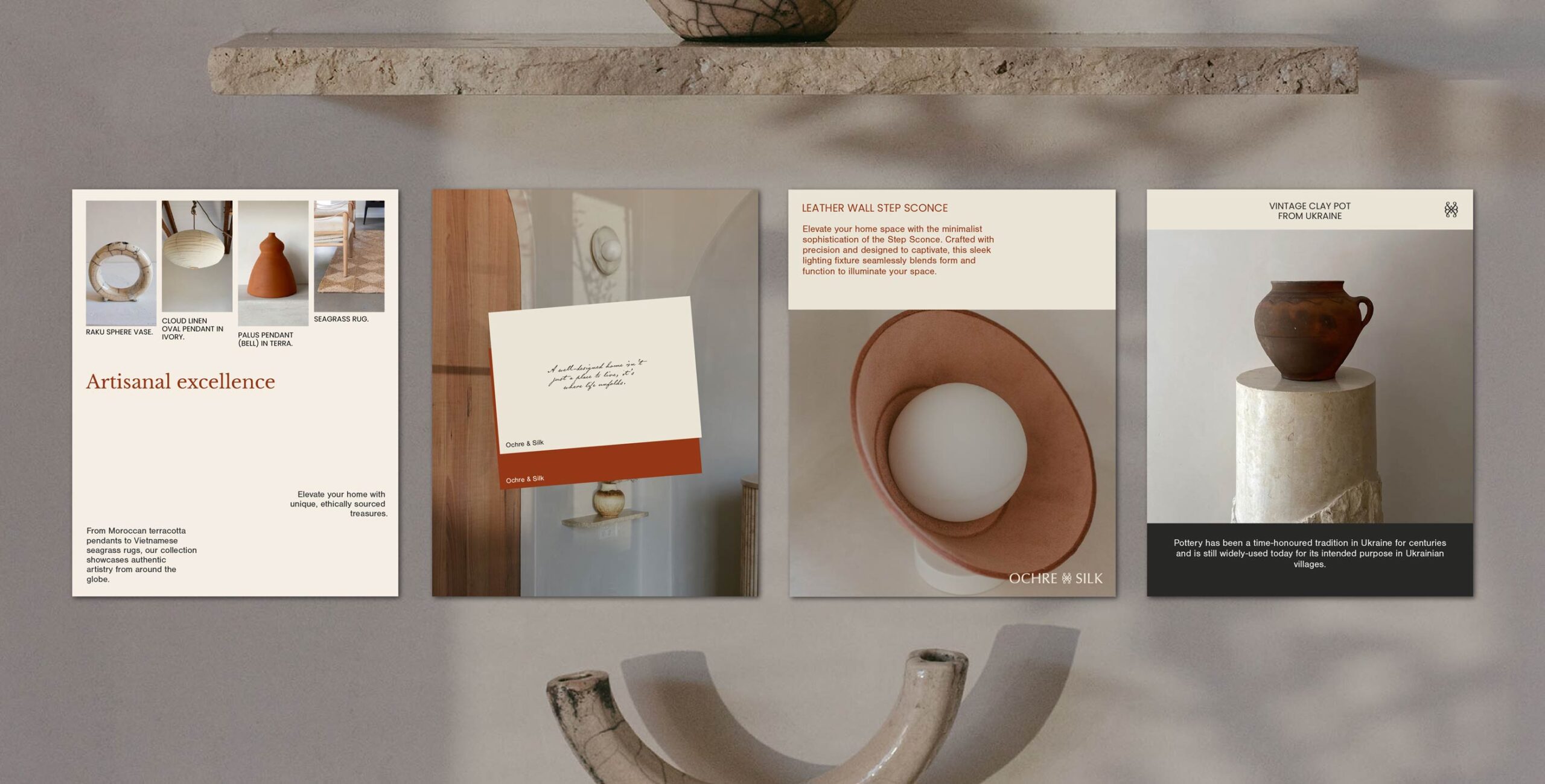
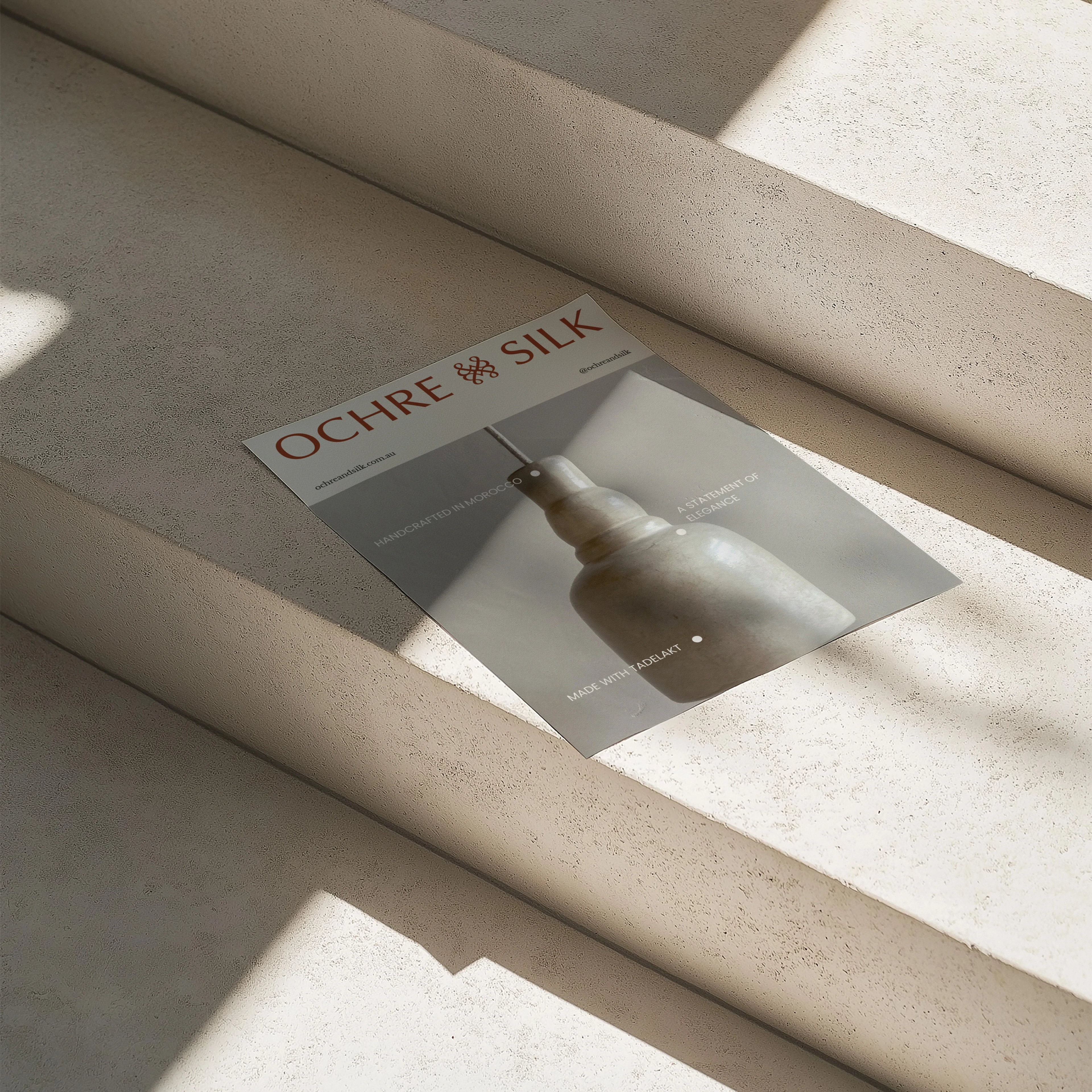
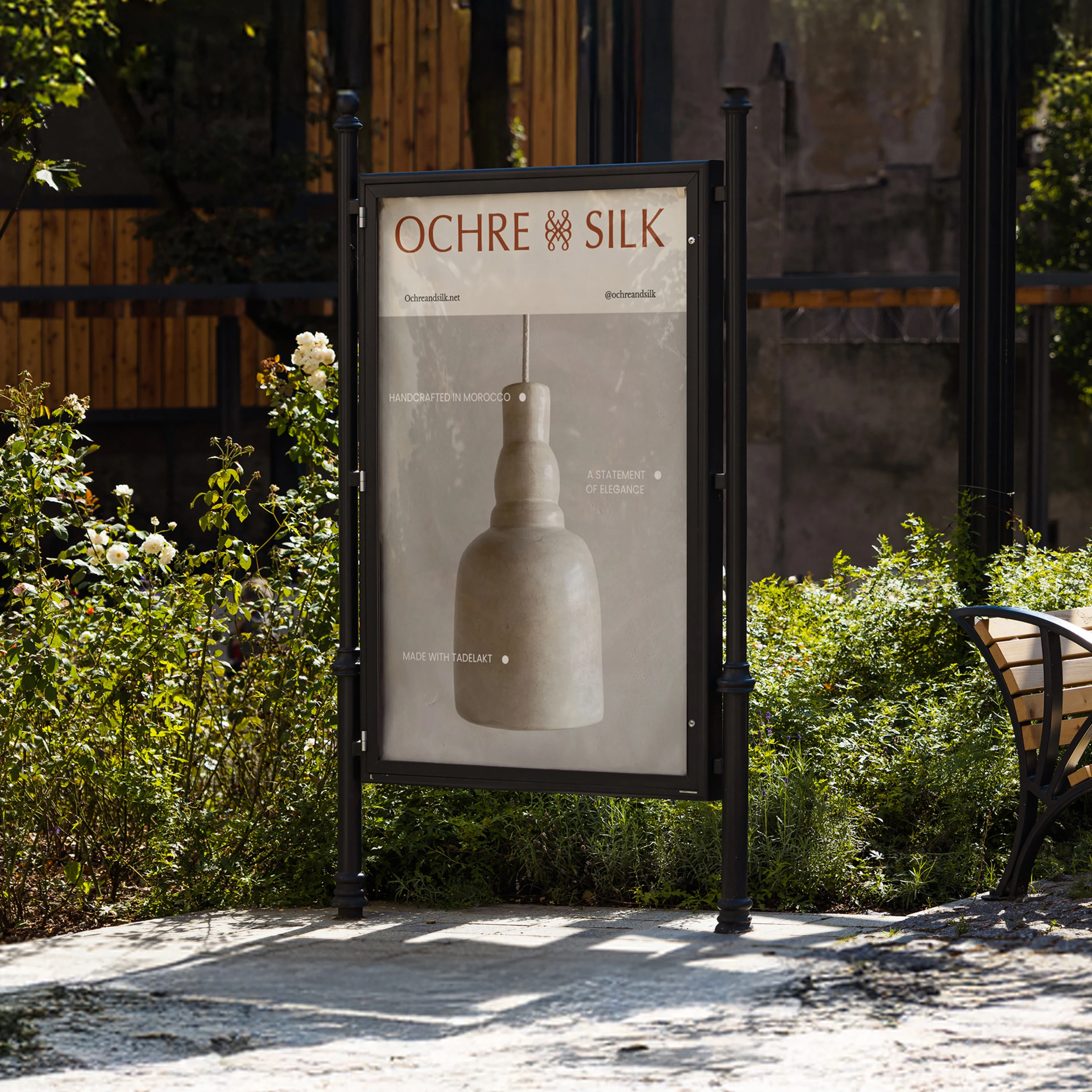
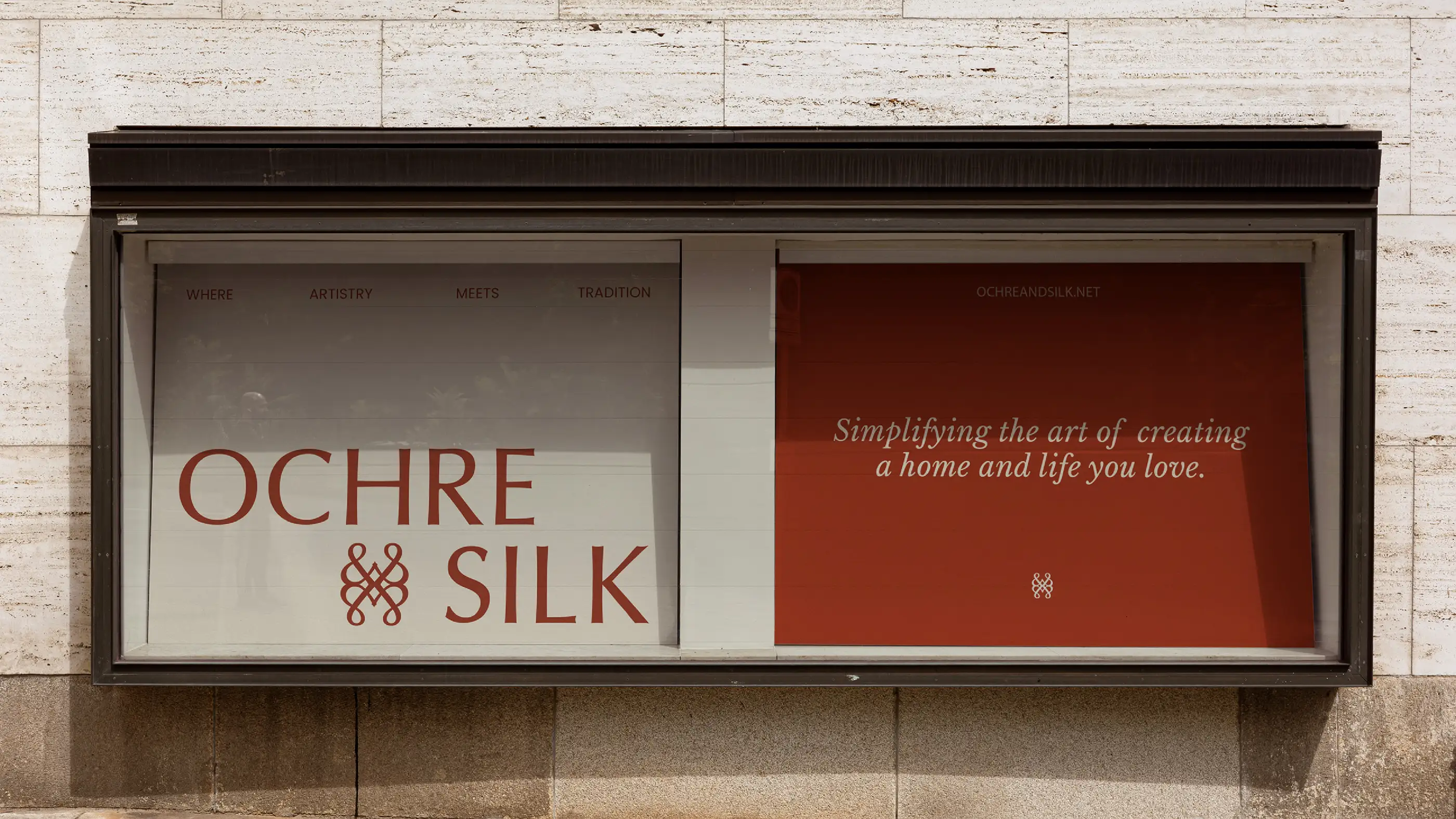
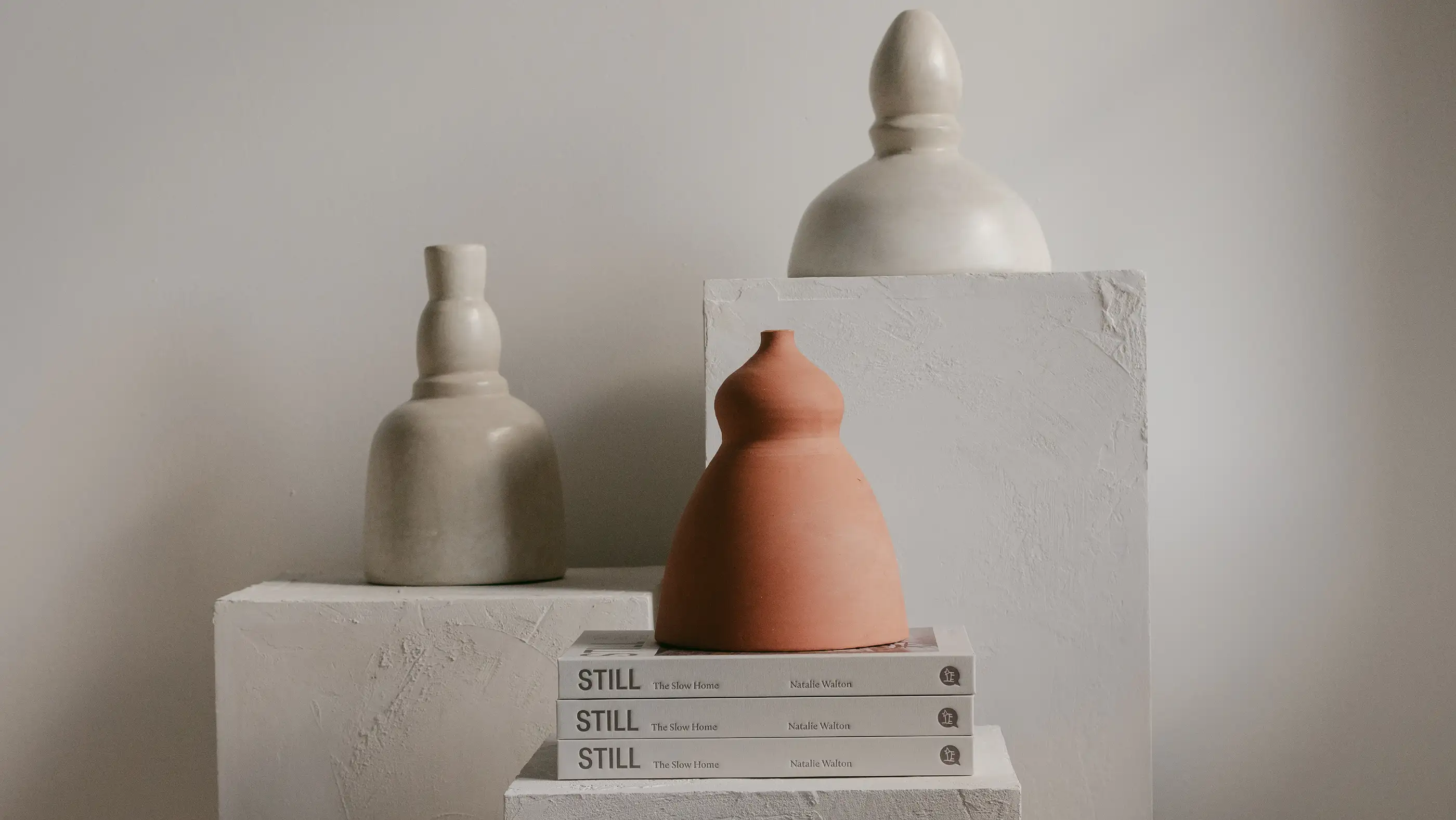

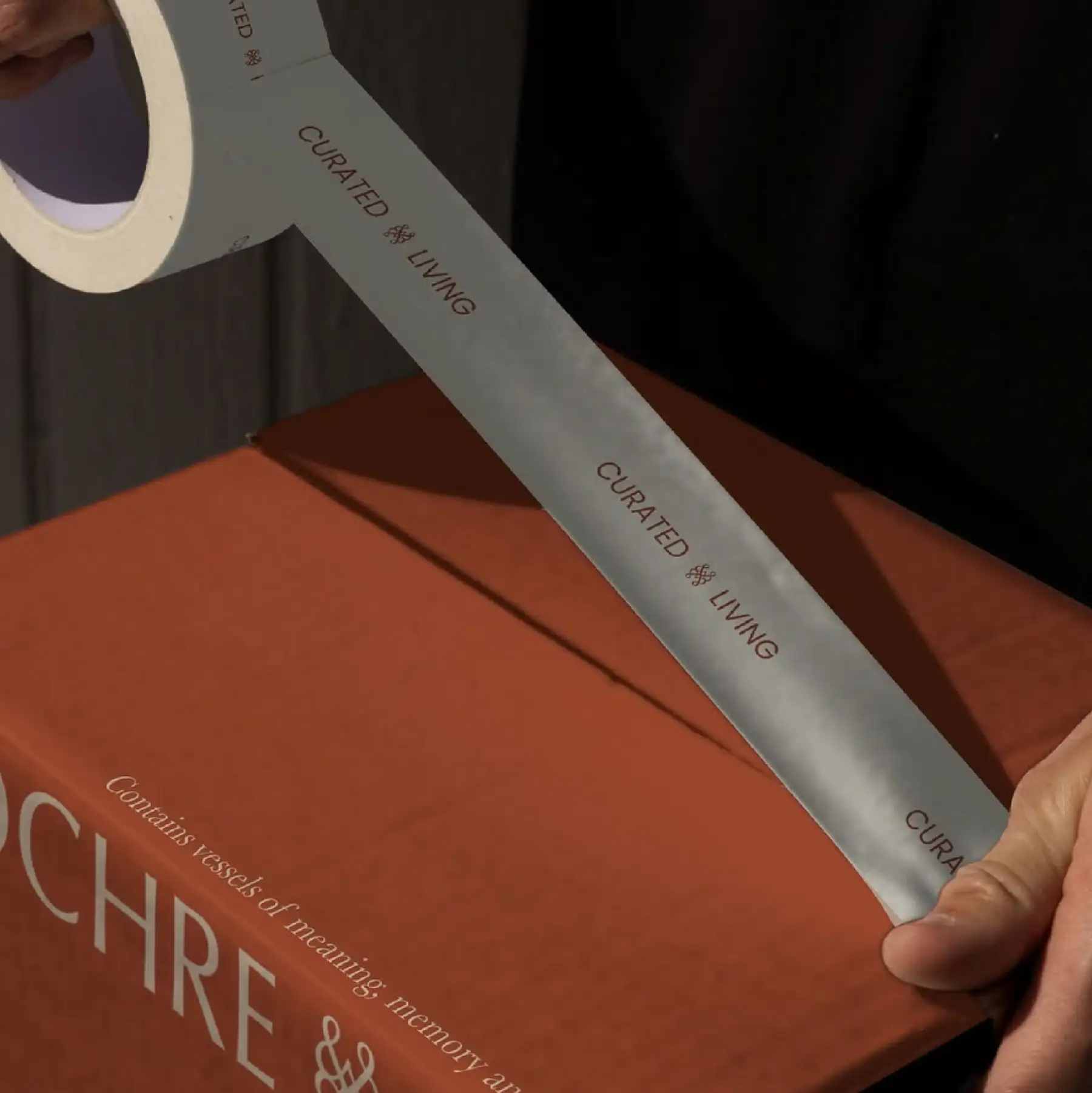
The Strategy and Execution:
Through extensive audience research and strategic positioning, we uncovered a shift happening within the category.
People weren’t simply buying homewares because they looked beautiful. They were increasingly searching for meaning, provenance and connection. They wanted objects with stories attached to them. Pieces collected from different corners of the world. Objects that carried history, craftsmanship and character.
Because what’s better than the items in your home becoming the best dinner-table conversation starters?
This insight became the foundation for Ochre & Silk.
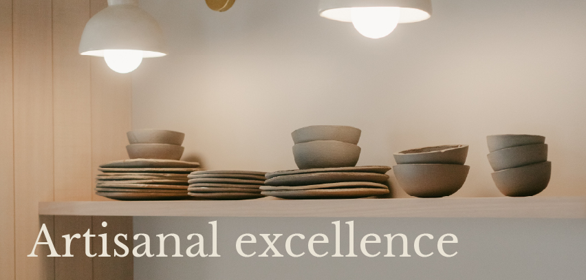
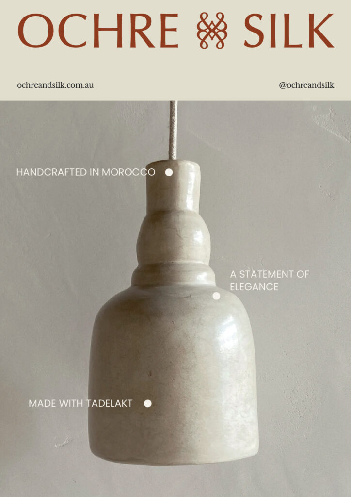
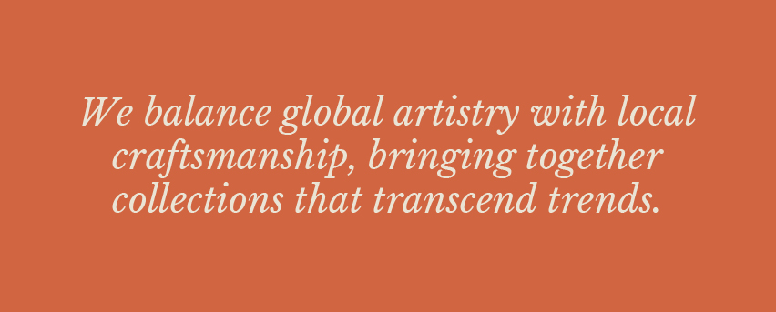
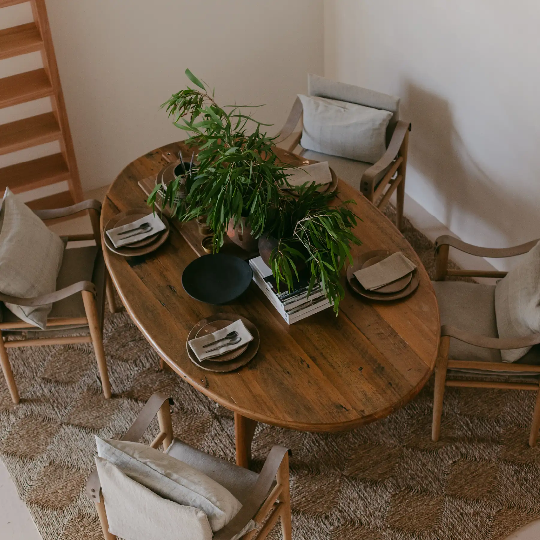
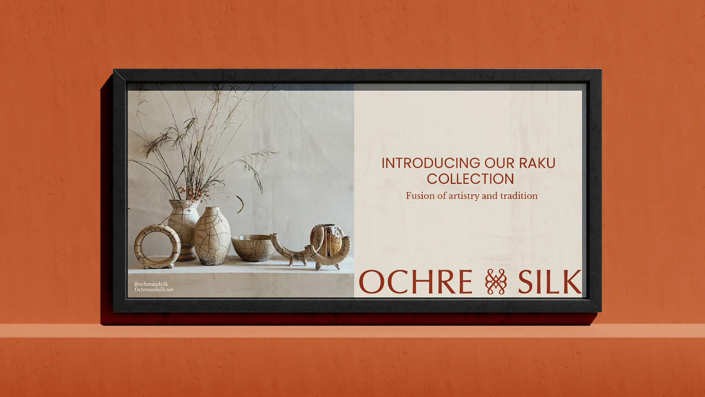
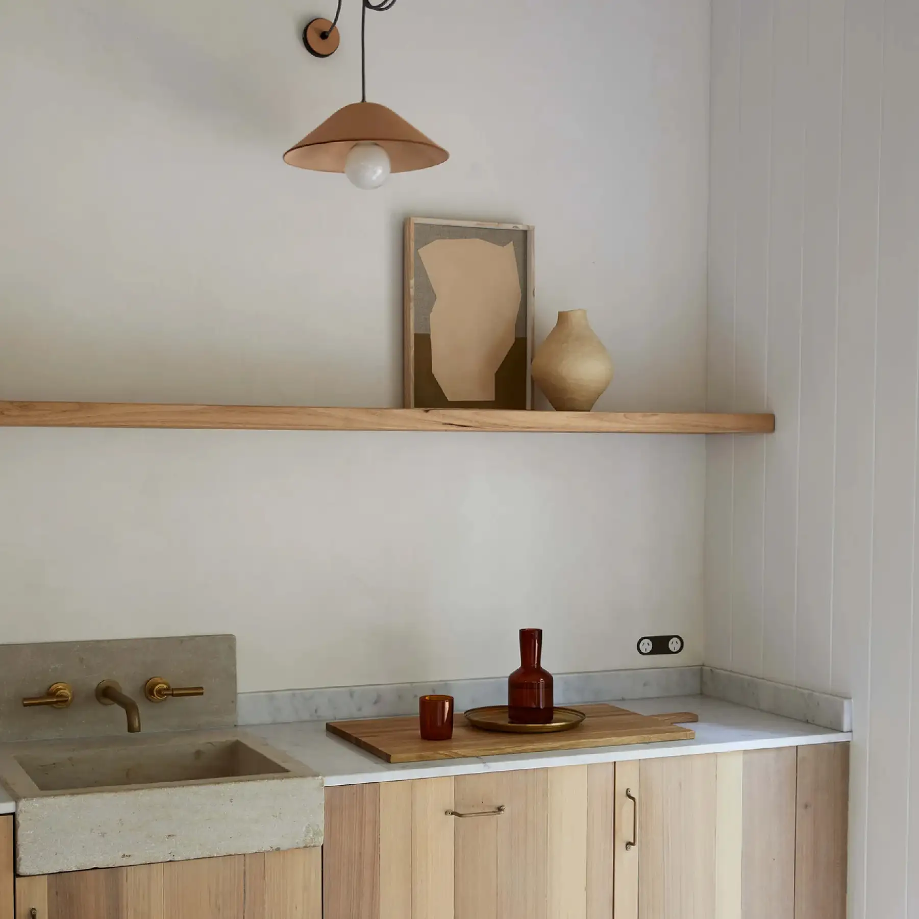
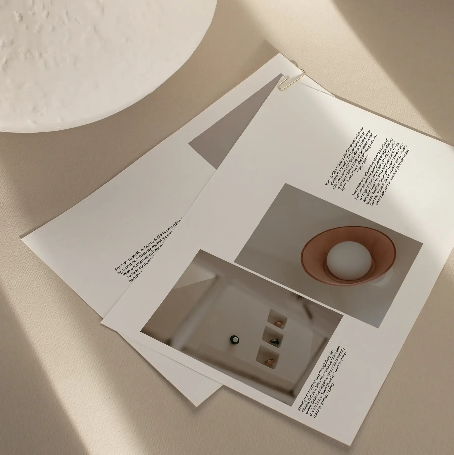
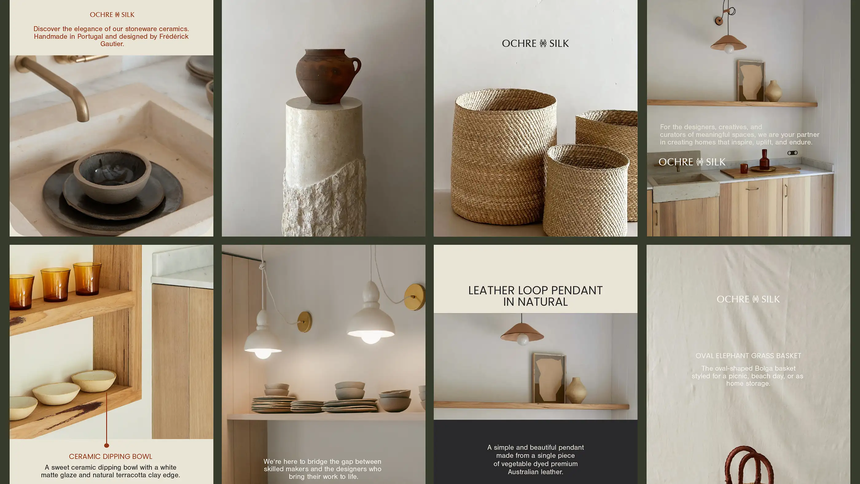
Rather than focusing purely on aesthetics, we repositioned the brand around the idea of the well-travelled home. A collection of globally sourced pieces, artisan craftsmanship and thoughtful objects gathered over time rather than purchased all at once.
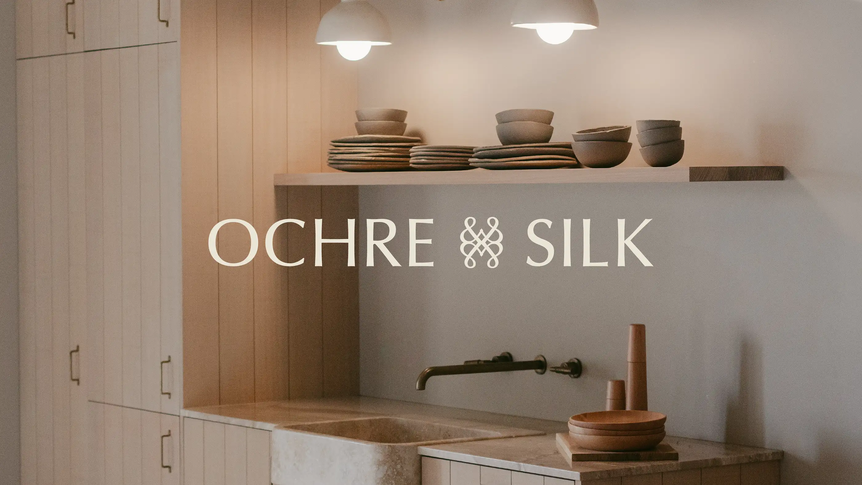
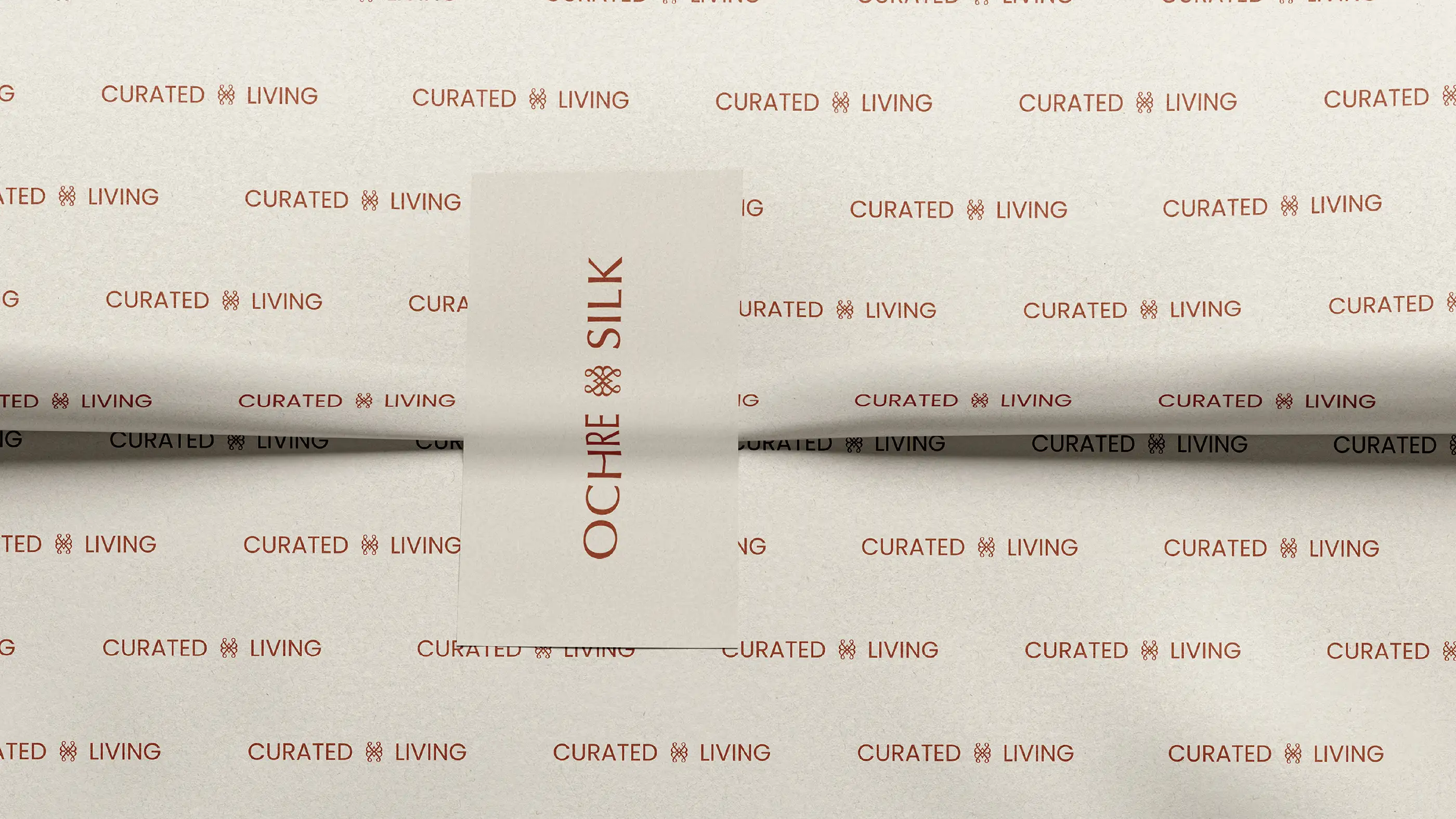
The name Ochre & Silk itself became symbolic of this balance. Earth and refinement. Local and global. Texture and elegance.
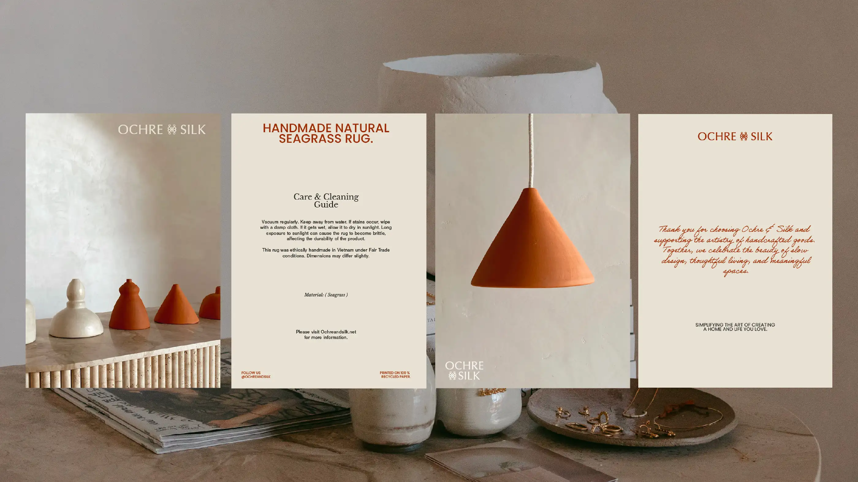
Every strategic decision was designed to create a richer, more layered brand world that could support not only product collections, but future storytelling, content, community and cultural relevance.

The Outcome:
The final result was more than a rebrand.
It was a carefully considered evolution that allowed the business to step confidently into its next chapter while maintaining the trust and recognition built over years.
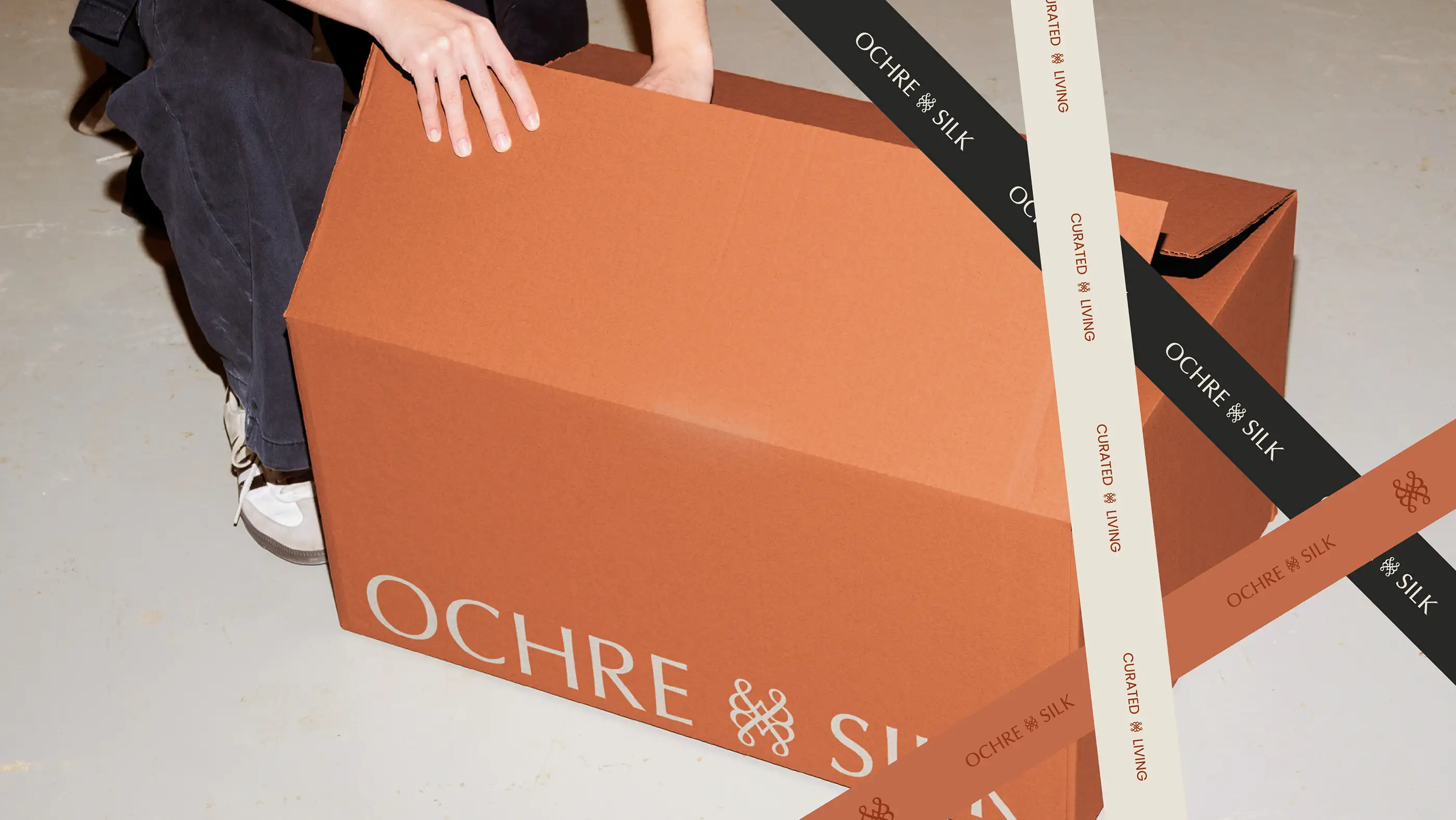
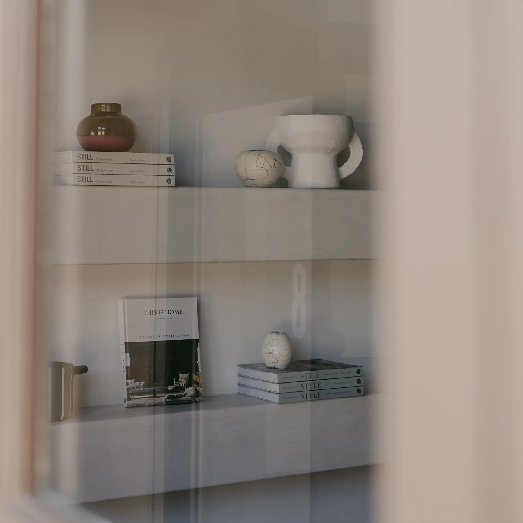
Ochre & Silk emerged as a brand with greater depth, stronger differentiation and a more emotionally resonant point of view. One built around the belief that the most meaningful homes aren’t designed overnight. They’re collected slowly through experiences, stories and objects that become part of our lives.
The result is a brand that feels less like a retailer and more like a trusted guide. One with exceptional taste, endless curiosity and a story worth bringing home.